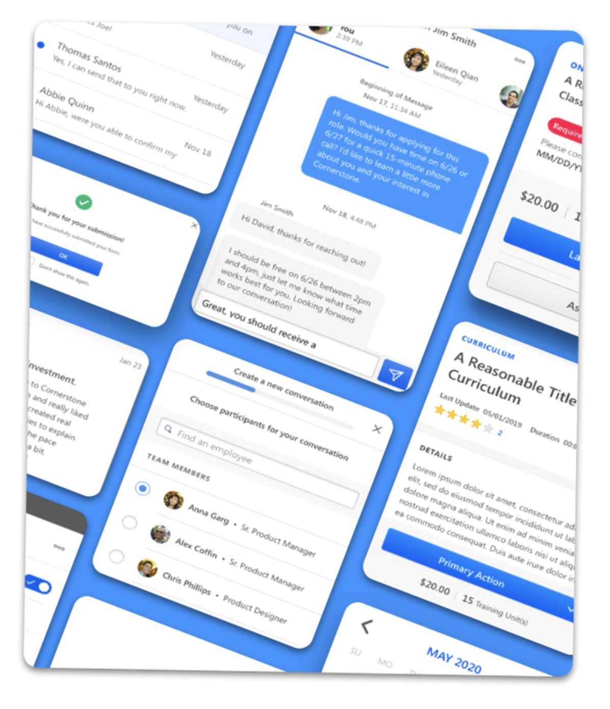
Design Systems for Cornerstone Ondemand
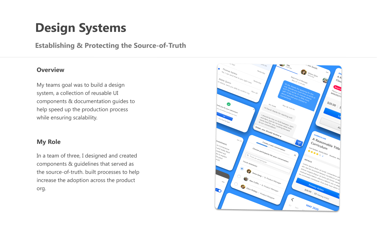
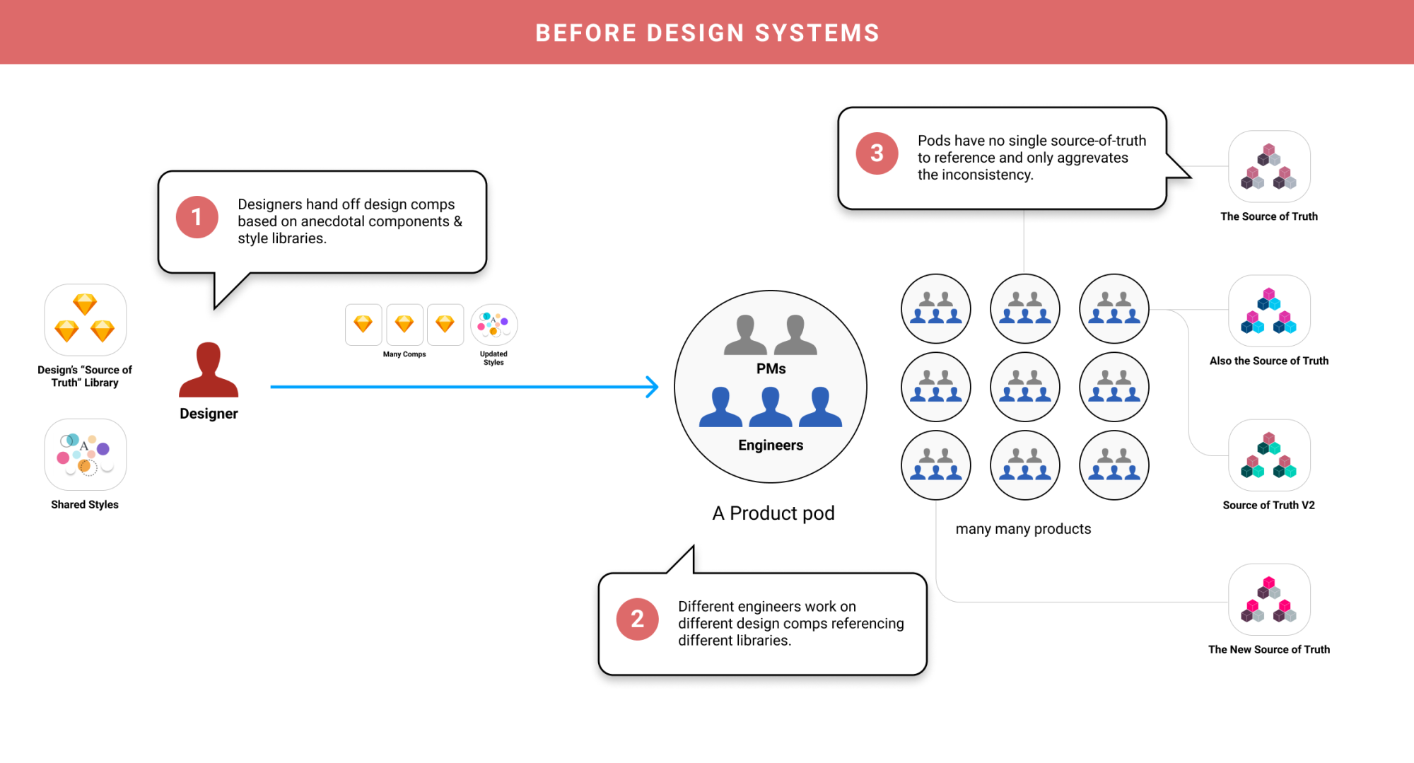
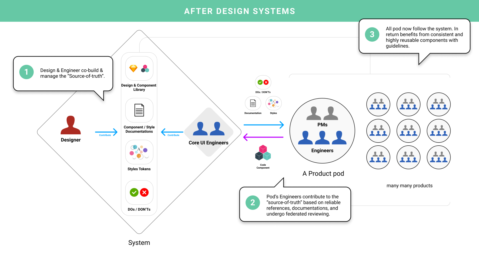
At Cornerstone, I co-founded the atomic design system with a tight-knit team of designers and engineers. The goal was clear: bring order and scale to a growing product ecosystem that had become fragmented over time.
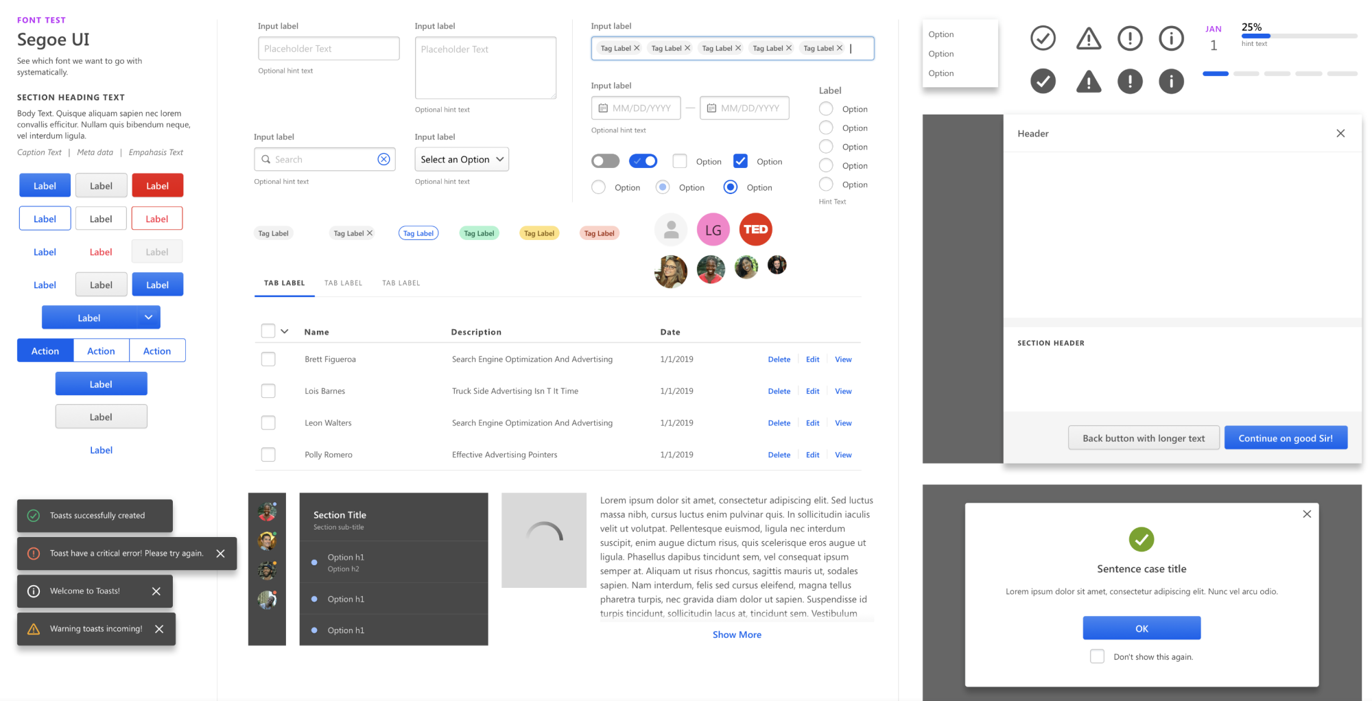
I focused on designing and maintaining the core UI components, working closely with our dedicated engineers to ensure precision from Figma to code. We built a process that funneled wireframes into standardized system components—streamlining the handoff between UX and UI, and grounding our work in real product needs.
In just six months, we delivered around 80% of the foundational library, complete with documentation, guidelines, and coded components. As adoption spread, the system became a game-changer—boosting UI feature development speed by roughly 80% across teams. What started as a cleanup effort became a scalable engine for faster, more consistent product delivery.
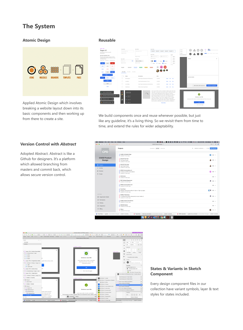
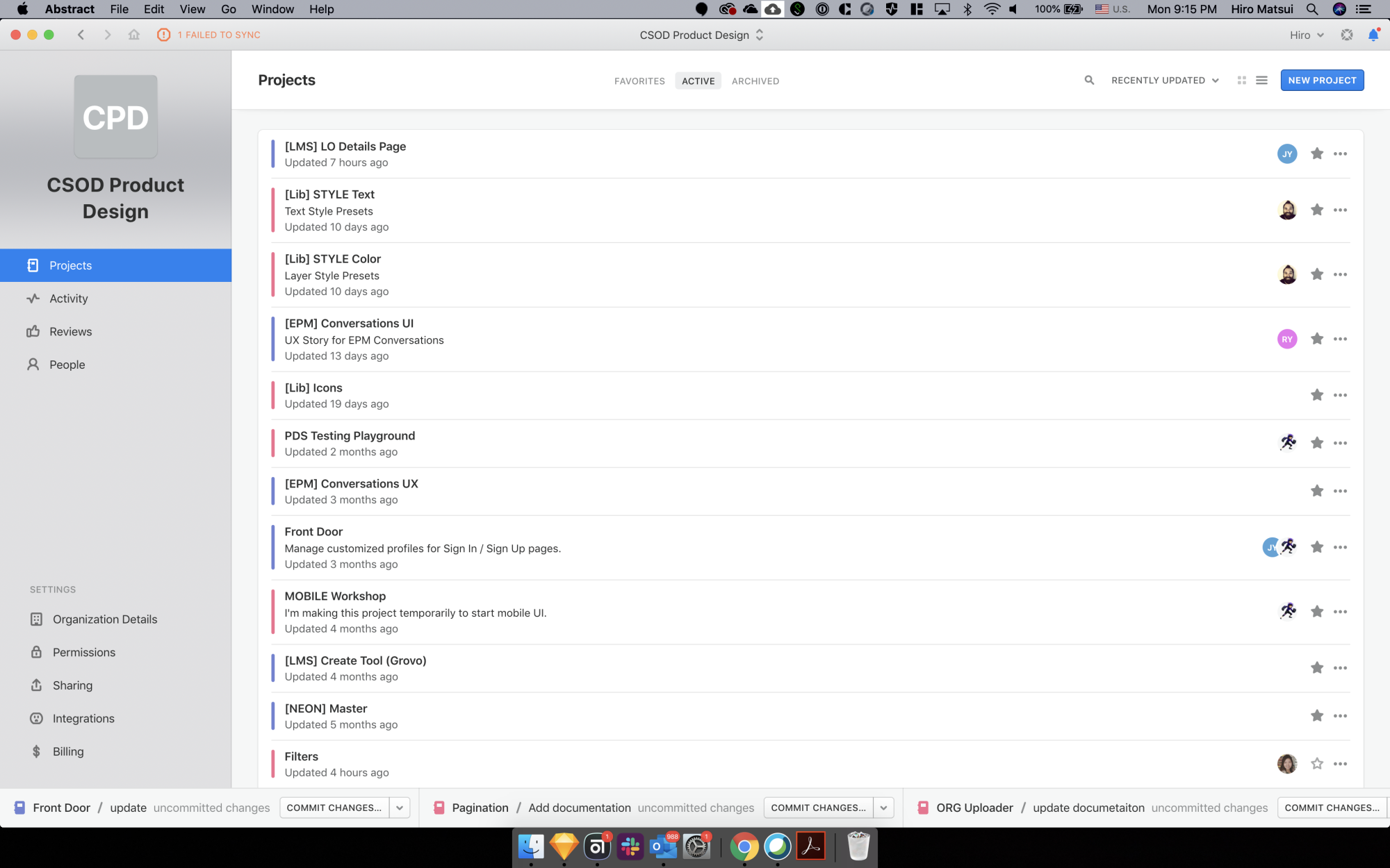
↑ We utilized "Abstract", a product similar to github, but for designers to manage their "Source of Truth" Sketch files.
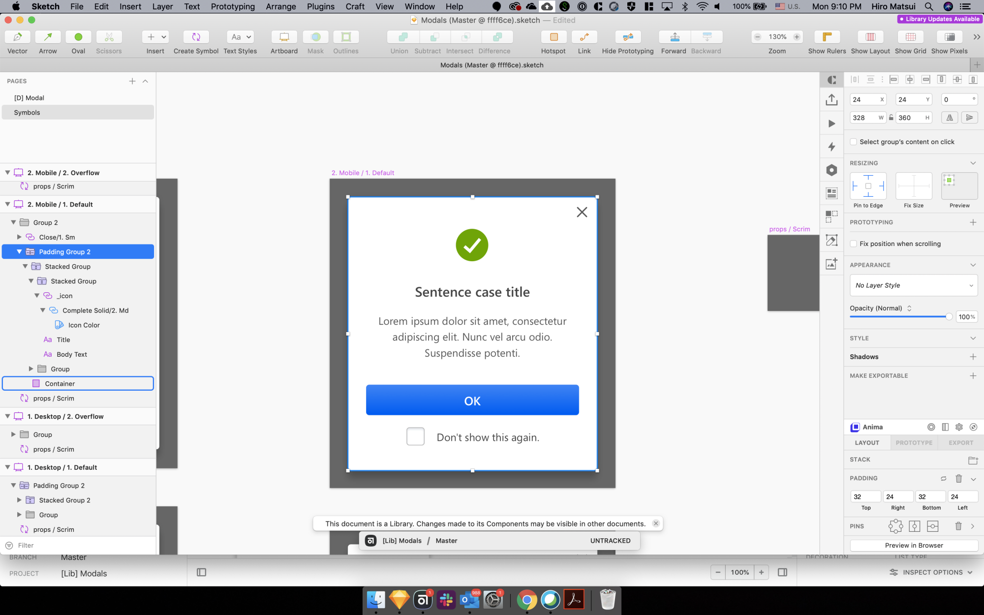
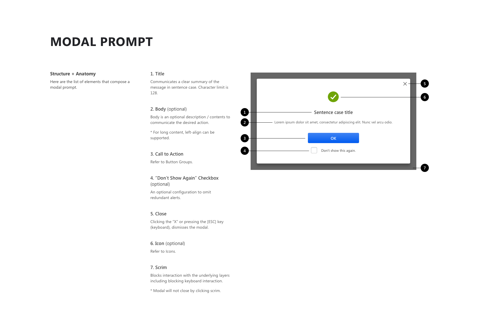
↑ Let's take a look at the "modal prompt" component in our library and how it's built, documented.
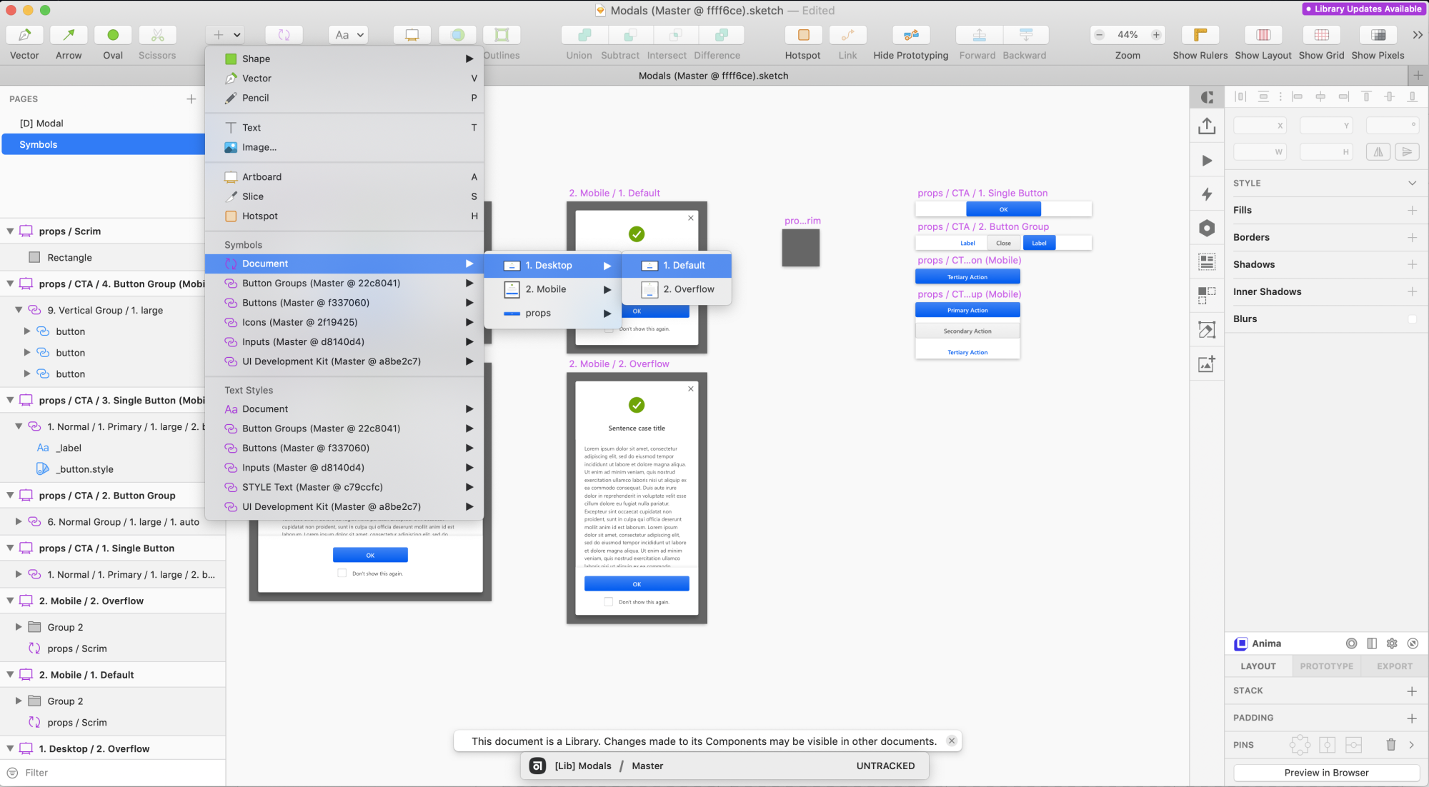
↑ We organized all our symbols in a systematic and intuitive way, so any designers can link the Sketch library and find what they're looking for.
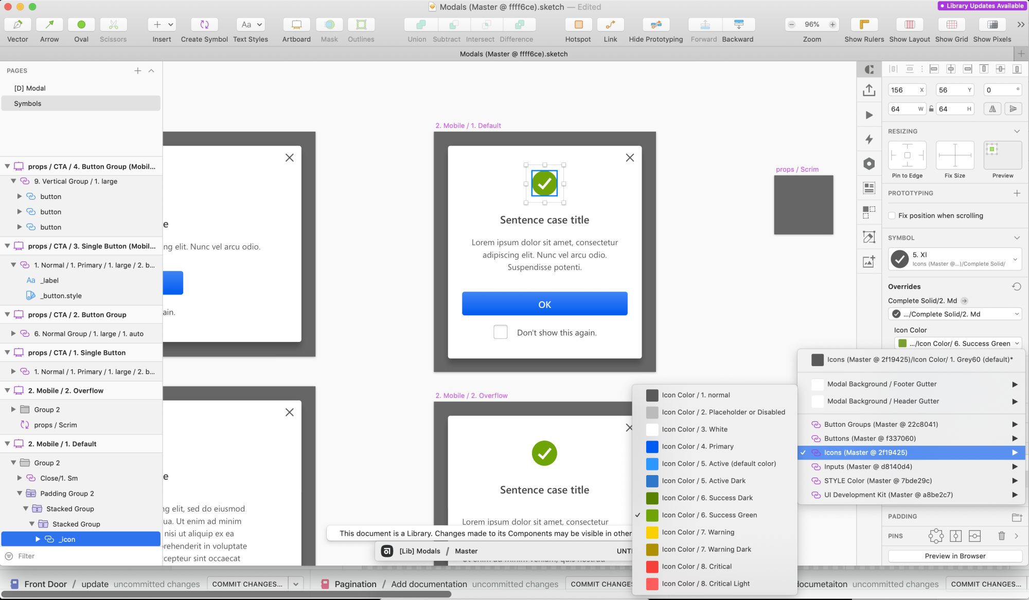
↑ Text styles & layer styles are also organized systematically, allowing designers to quickly switch between the color options given to the component.
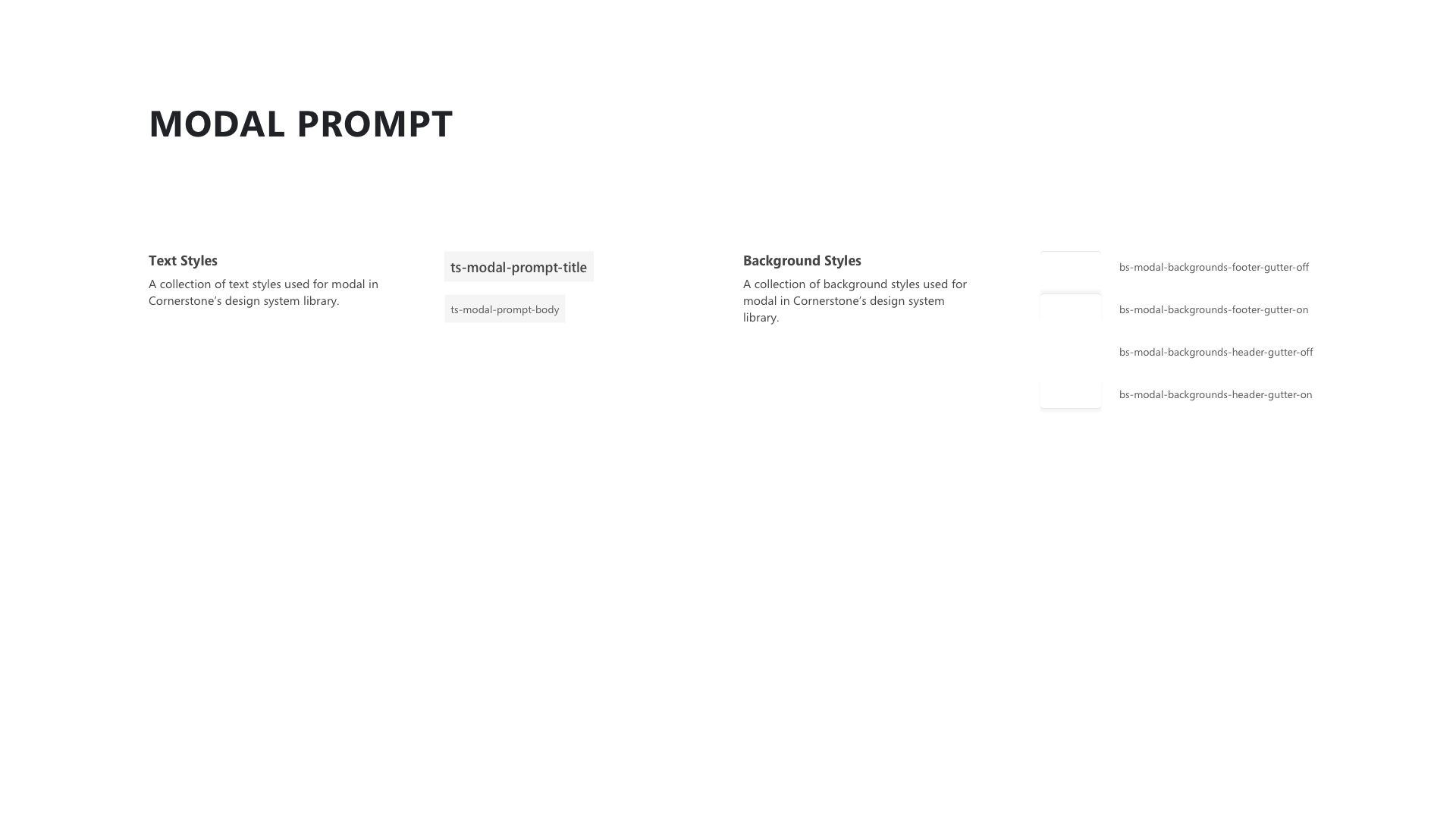
↑ Text & Background Styles is a dedicated section for listing out all text styles & background (layer) styles we use for the component. Contrary to a typical style guide, these styles are component-specific, and is often independent from the rest of the component text & background styles.
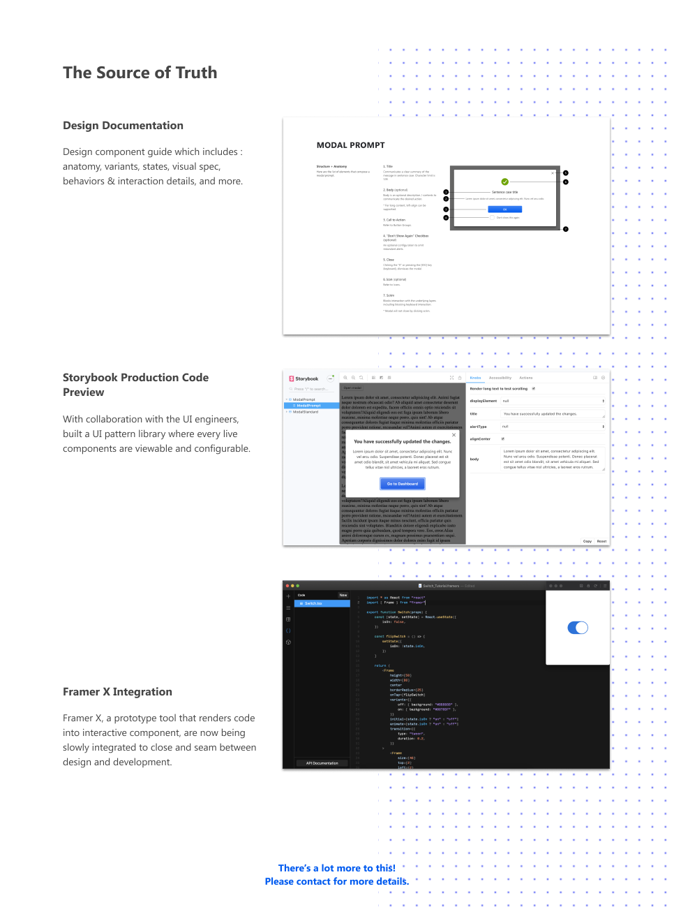
↑ "modal prompt" Design Documentation.
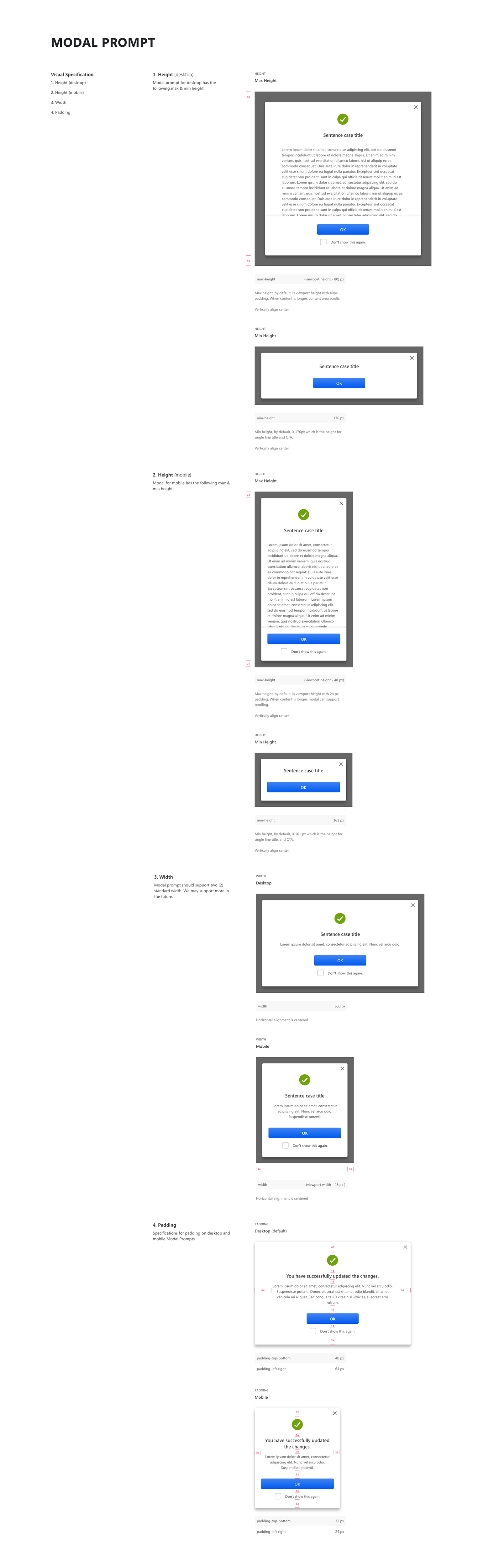
↑ Visual Specification is where we provide most of the crucial red lines as well as the dimensioning configuration option we support for the component.
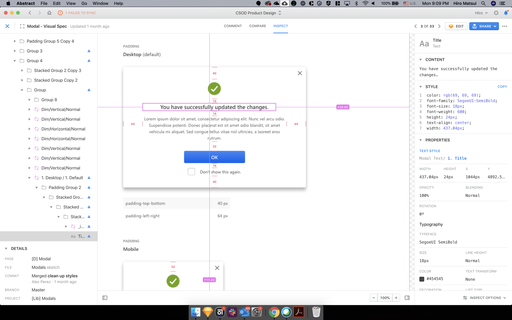
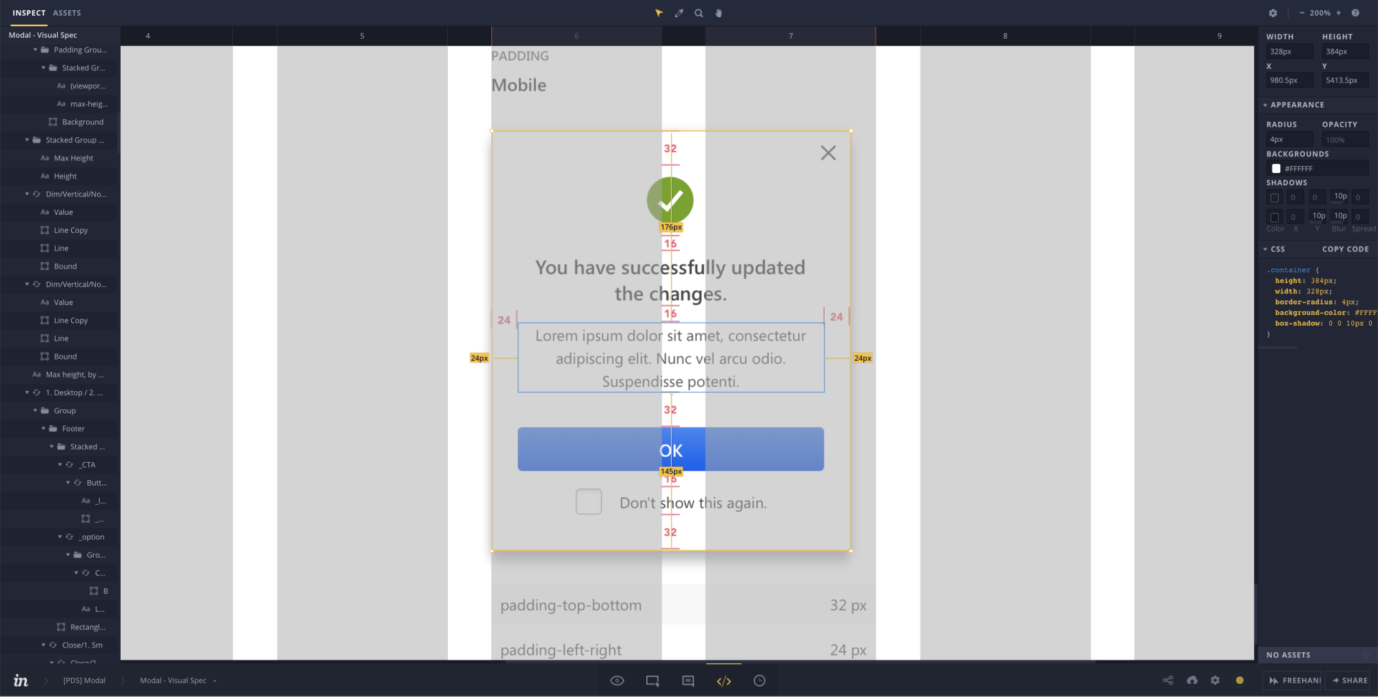
↑ Our source of truth stays within Abstract server. Here we have the capability to inspect our design as well as view changes/updates made from the previous version.
↑ We upload these spec to Invision and allow our internal collaboration and reviews. Invision is also our way of handing off design spec to developers. Then we conduct Design QA, and once approved, the component will be merged into our library
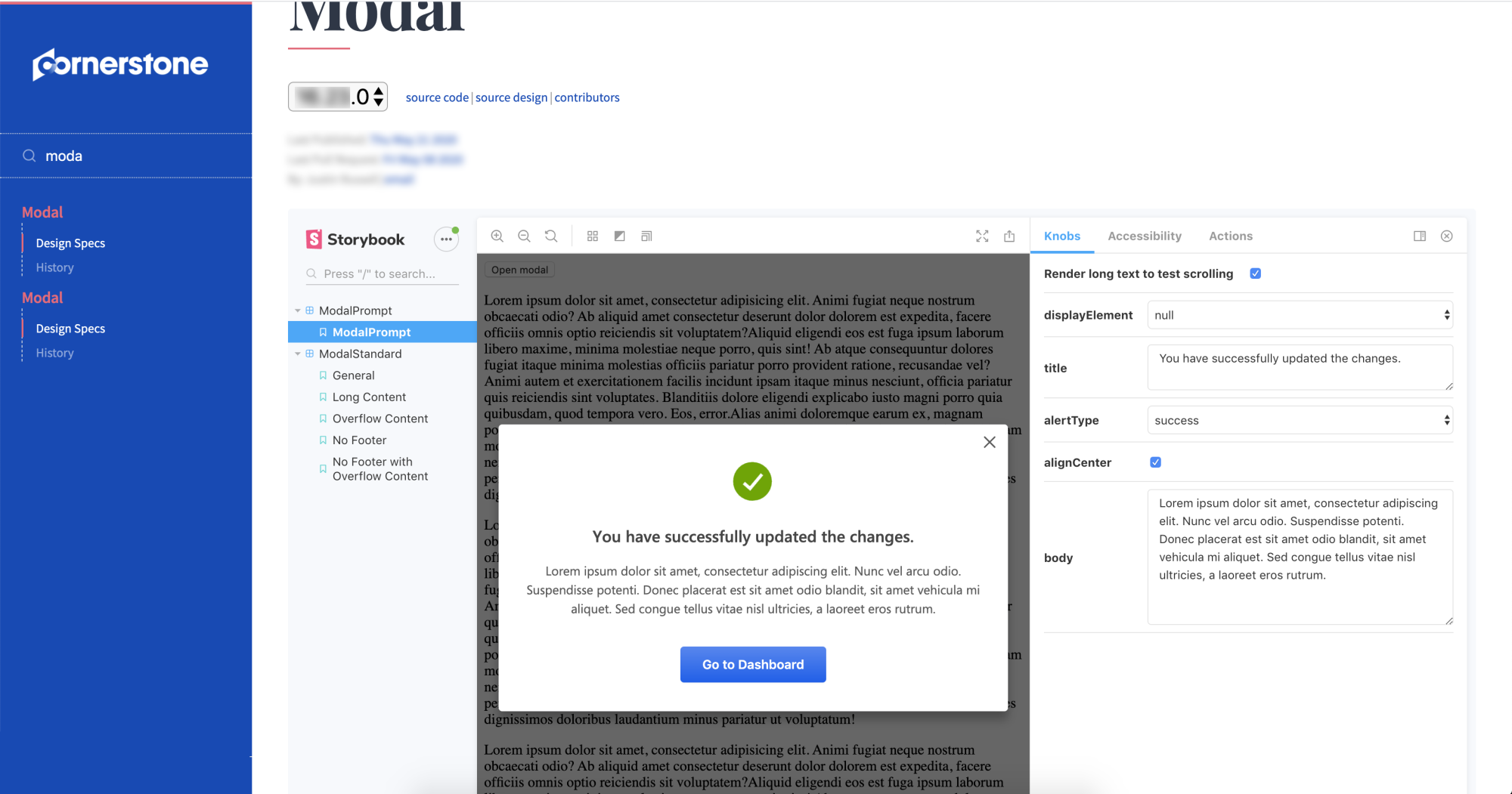
↑ React component library. Front-end UI team utilized Storybook for React to build a sandbox environment to demo the component for all stakeholders.
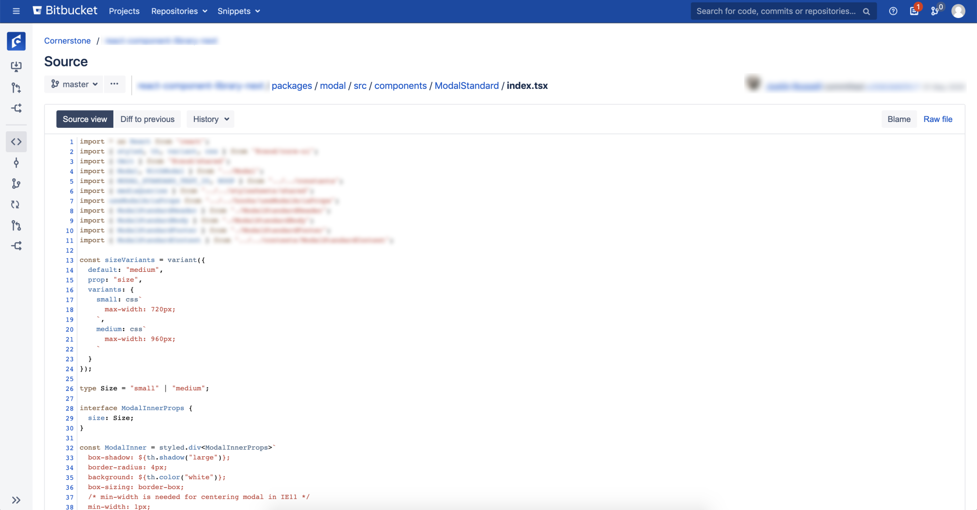
↑ Source code. We UI design & the front-end UI design team always try to stay aligned so the source code structure, naming conventions, configurations correspond to the design specification.
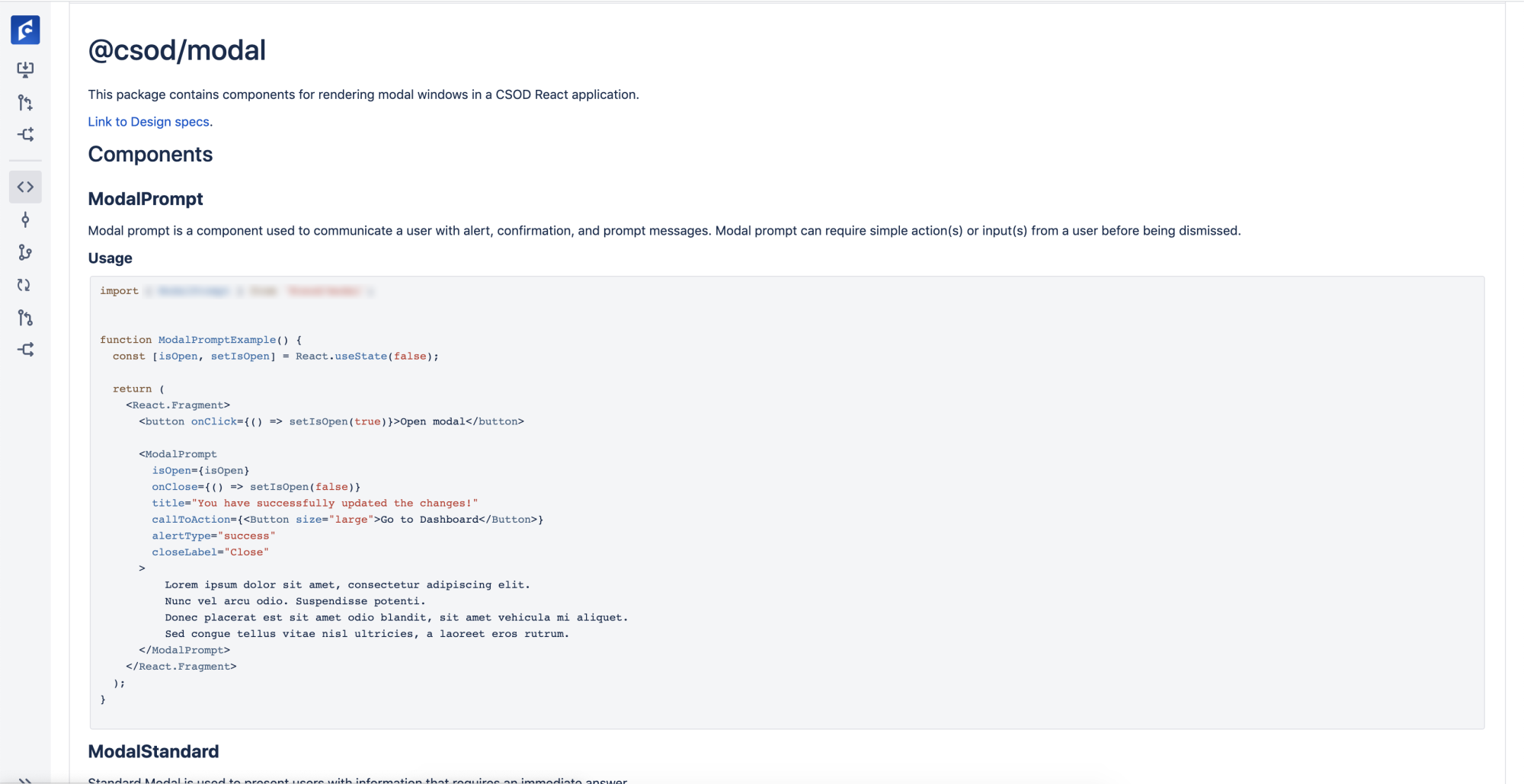
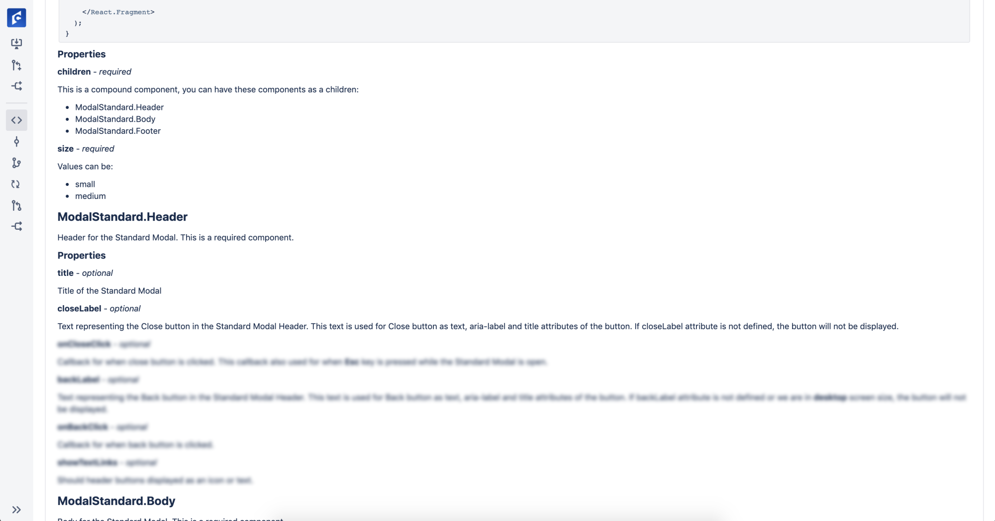
↑ Section of "Read Me' for the React component.
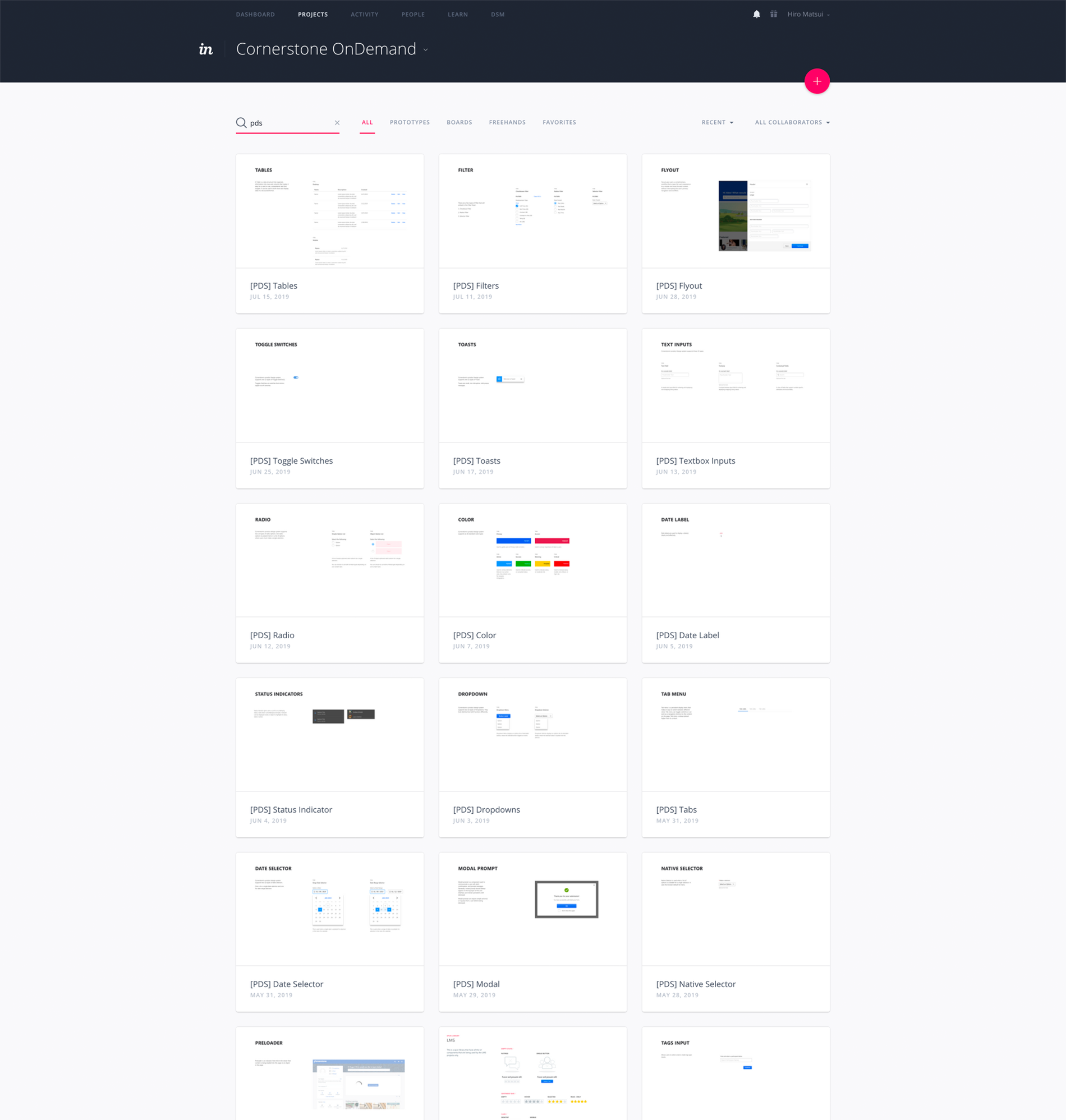
↑ Every single one of our components go through the same process to be built and documented into our Design Systems.
Contact for More Info